Chase Ultimate Rewards (UR) is a points program within all of Chase credit cards. UR is one of the most engaged platforms across all products that offer it, but users are not taking advantage of all the redeemable offerings.
My role
UX lead–discovery, user research, and wires.
- Partner with stakeholders to identify the user base.
- Designed solutions that address user pain points.
- Establish a framework that has a holistic user experience.
The team and duration
Worked closely with a product manager, brand designer, and Chase tech leads to implement the Chase UR hub. The entire engagement was for 4 months. This wasn't built in-house due to Chase security and archaic system.
problem
Many customers redeem points in only one way, often choosing an option that is perceived to be maximizing the monetary value of points and/or out of habit. We need to change customers’ mindset so that points are not only valued with monetary worth.
Chase Ultimate Rewards hub had useful information for the user, but the hierarchy and layout of the page were confusing. Even though a user is able to redeem their points quickly, there is no information about their points activity and the benefits of the card. The user actually needs to find the right link to see their points statements.
Opportunity
- There may be an opportunity to leverage this high level of engagement to communicate the holistic value of Chase card products.
- Change the mindset/intention of redeemers to consider and try various redemption options by engagement in a holistic value-driven conversation.
- Highlight card and complimentary benefits to holistically tell the value story of products by establish products as the heroes
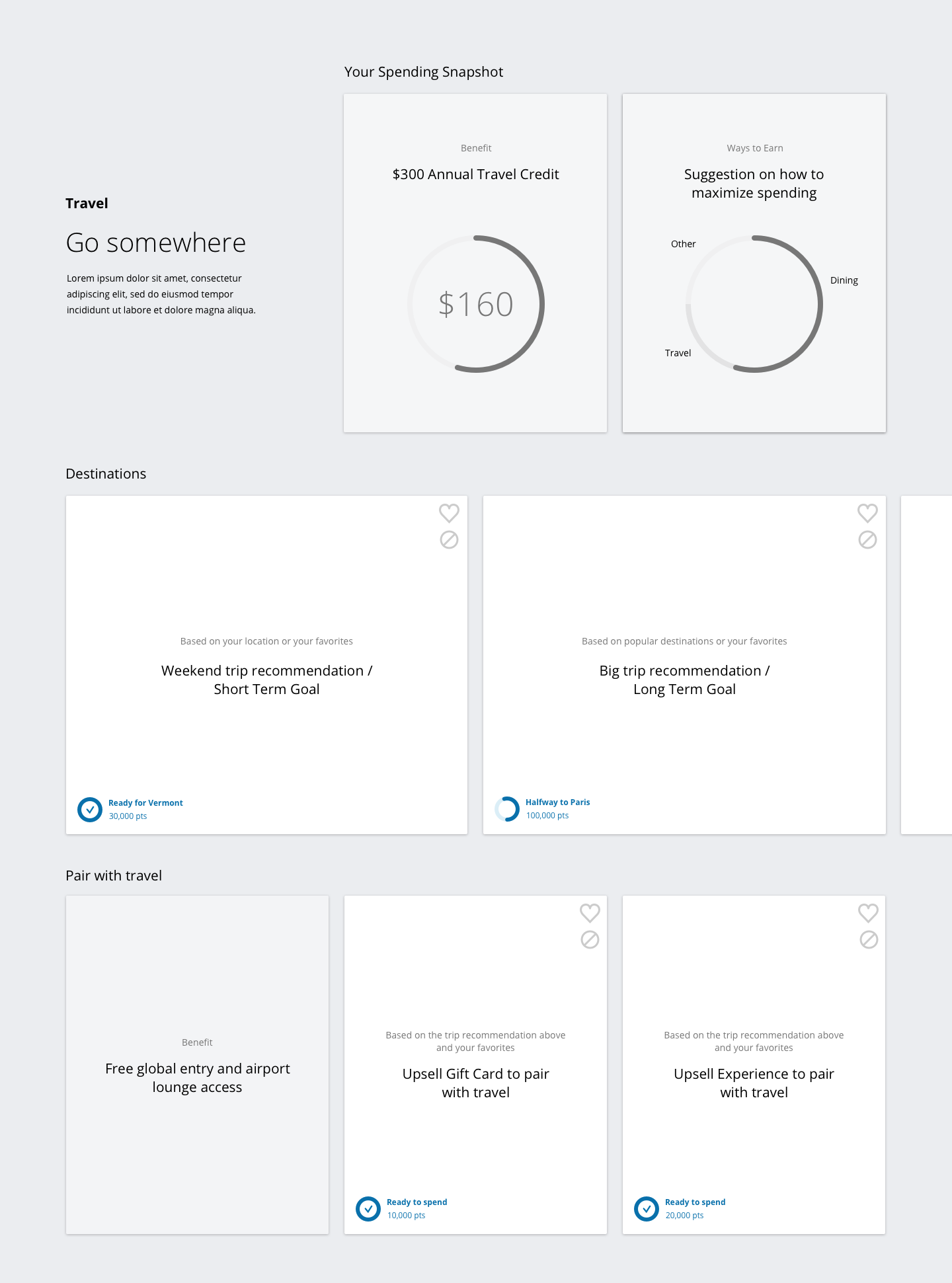
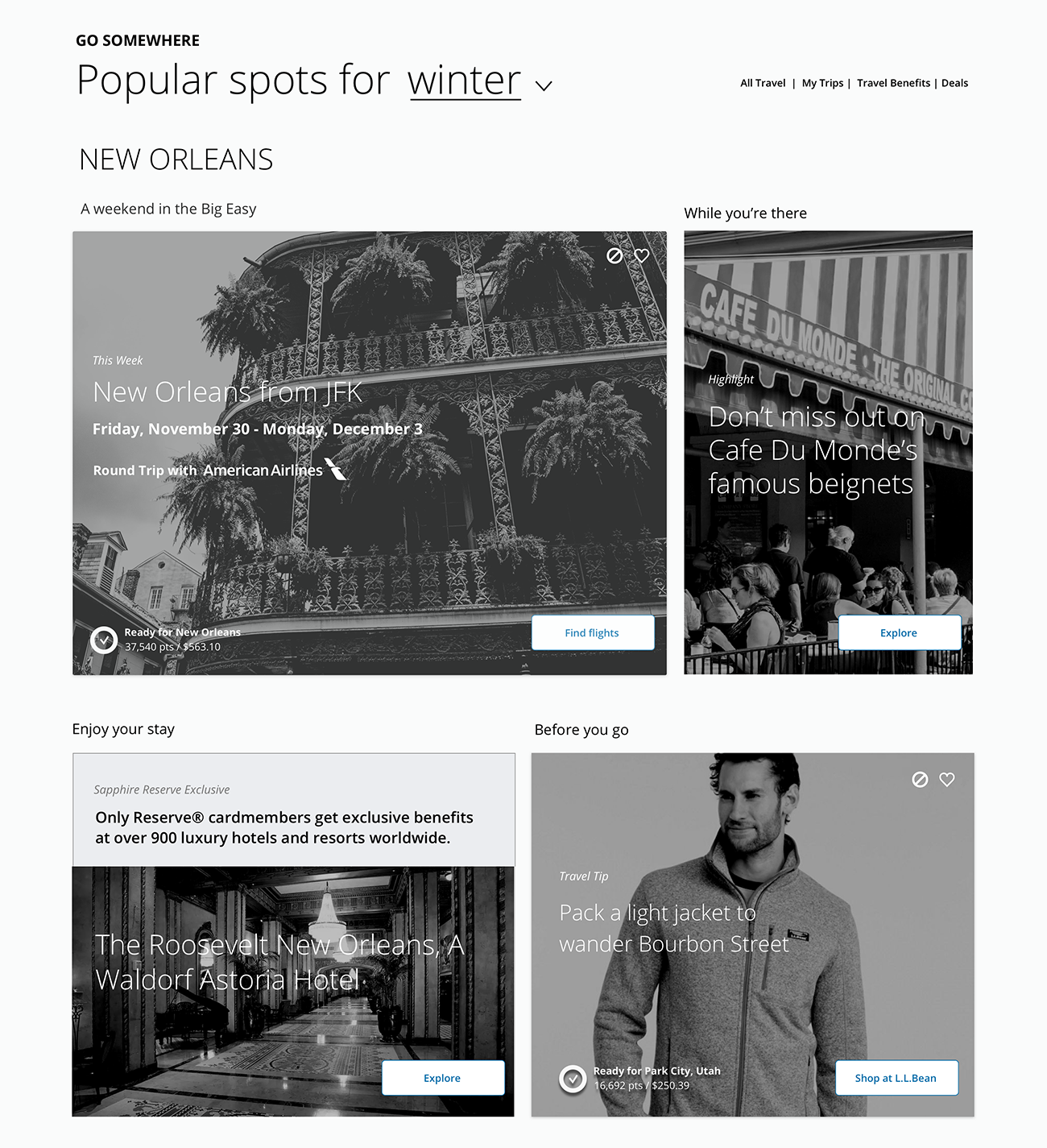
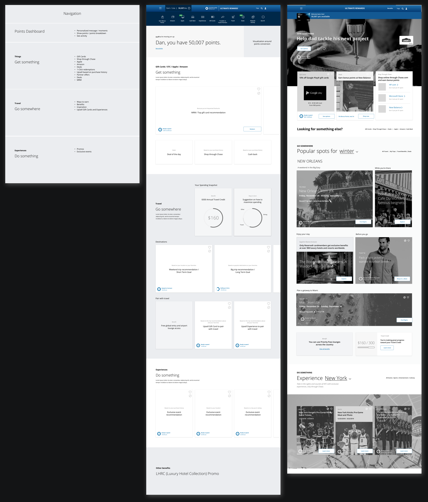
A place to learn and redeem
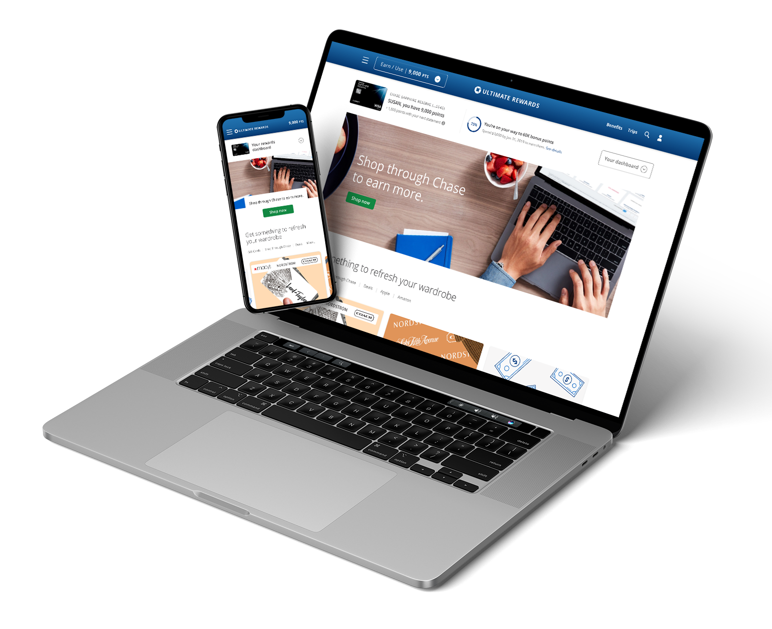
The Chase Ultimate Rewards Hub had full of potential to tell a great story and as designers we wanted that. We wanted each user to feel heard and have a personalized experience in their Hub. The redesign did just that. It gave a breakdown of points right at the top and the page structure encouraged users to set goals and redeem gift cards and/or travel.
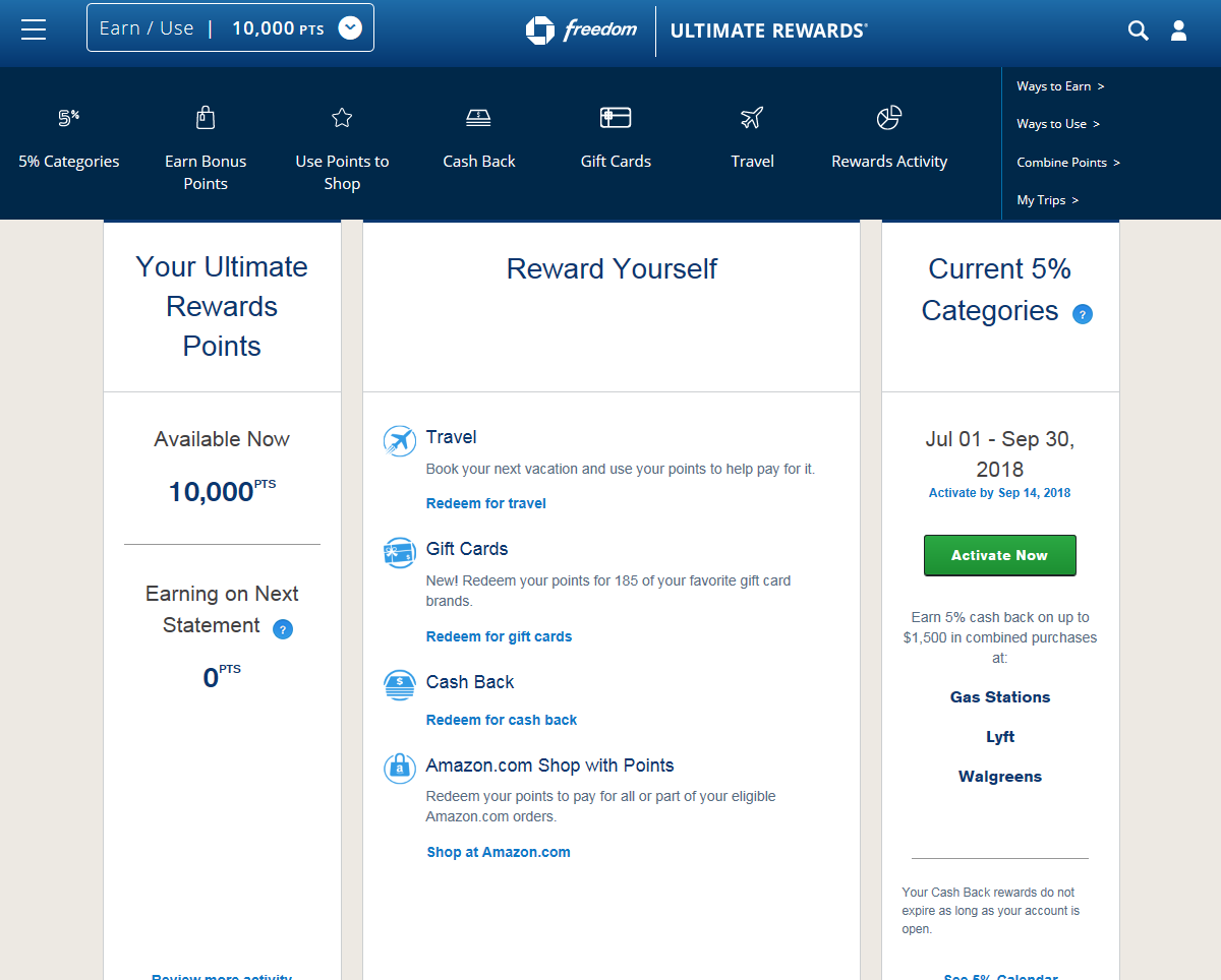
Before–The previous design of the UR hub was empty and didn't tell a story. The page allowed the user to do one thing and everything else was hard to find.
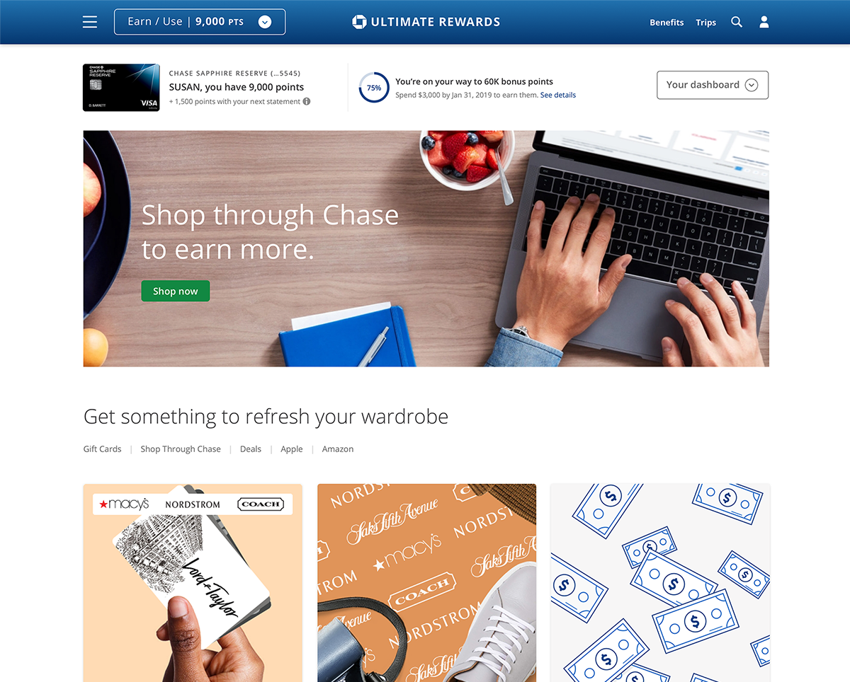
After–UR hub allowed users to set goals, give personalized recommendations, and educated users about their points activity and card benefits.
Solution
The Explainer
The UR hub will highlight how users can use their points through themed action-based lenses to redeem, earn, and learn. This allowed us to create a design system that has an infinite number of lenses (e.g., "Give Something", "Go Somewhere", etc.). It also sounds human friendly, without any of the financial jargon.
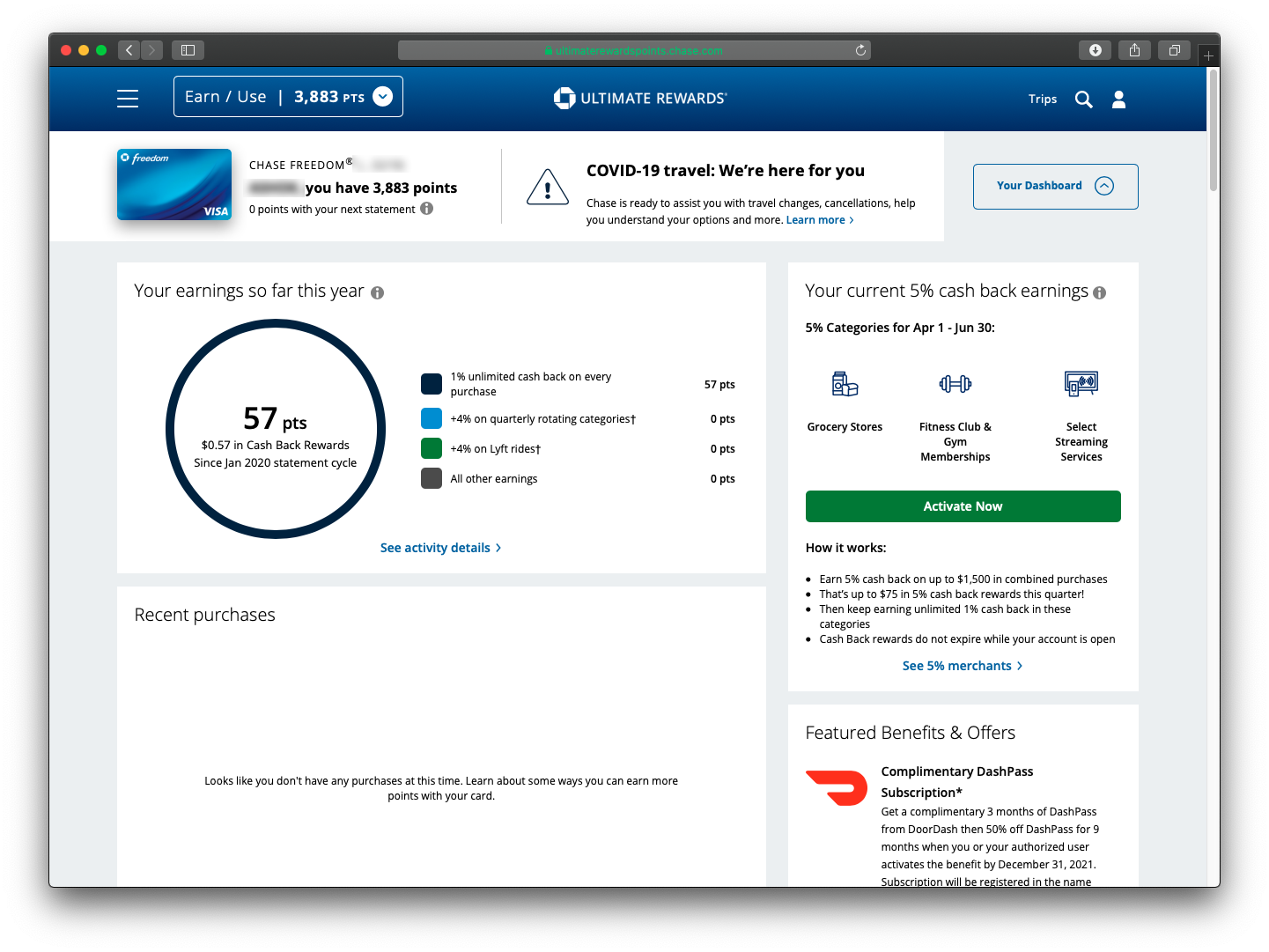
The dashboard, which includes the total number of points, points activity and card benefits were at the top. It didn't take too much real estate and yet it allowed us to include all the relevant information.
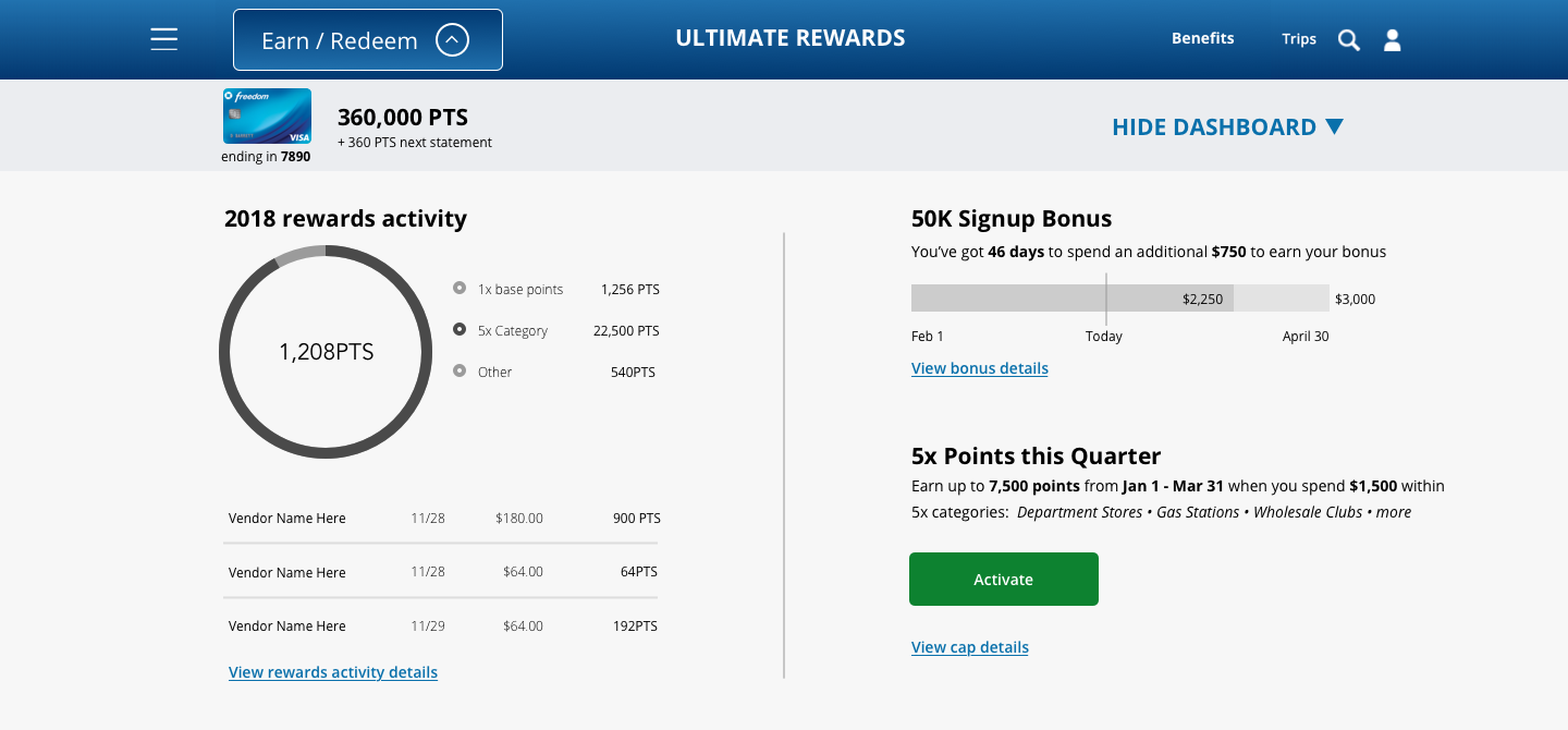
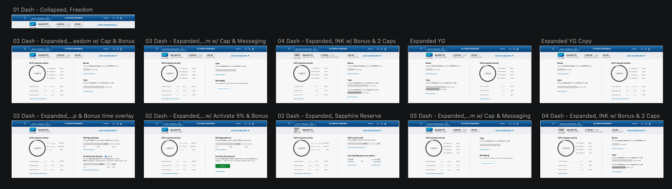
The flexing dashboard
The expandable dashboard bar was a great way to incorporate detail level points activity at the top. I wanted to create a simple and yet unintrusive solution for the user. During the research phase, I learned that Chase credit cards have amazing benefits and cardholders were unaware of those benefits and I wanted to include them in the dashboard. The dashboard also needed to flex depending on the Chase credit card. Each card had a different way of adding points and benefits. The system had to be dynamic depending on the card.
Taxonomy of the dashboard
- Greeting
- Reward details
- Rewards activity
- Card benefits
- Annual travel credit (Not relevant to some credit cards)
Give/Get/Go/Do
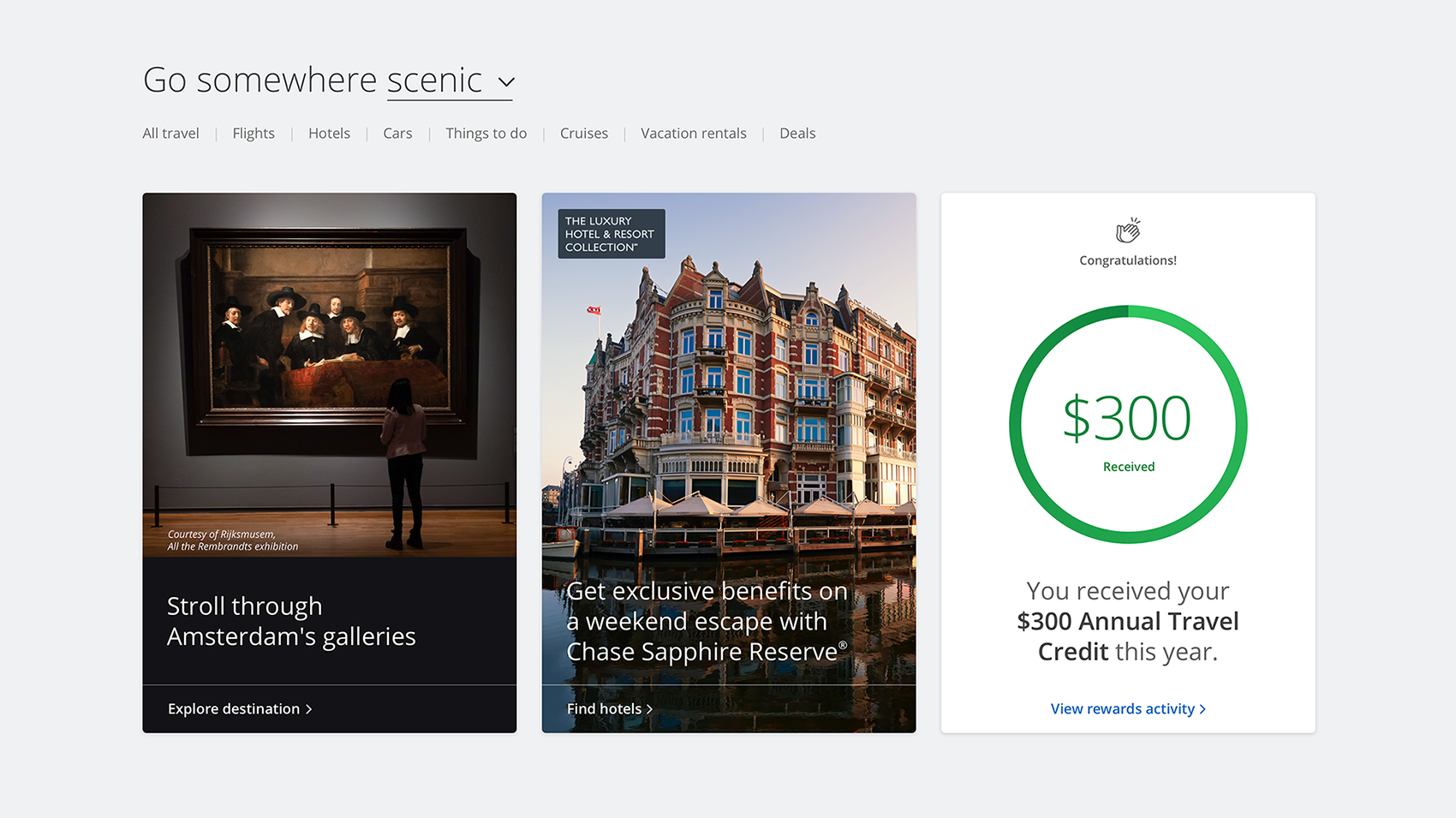
The UR hub told a story for the user and that story was "You Can Give Something, Go Somewhere and Do Something." The world was their oyster. This system encouraged them to use their points in a different way, rather than redeeming for cash. Right on the spot, we pictured gift cards (it was the holiday season) and exclusive discount deals.
The cards included the cash value of the item and the number of points the user needed to purchase that item.
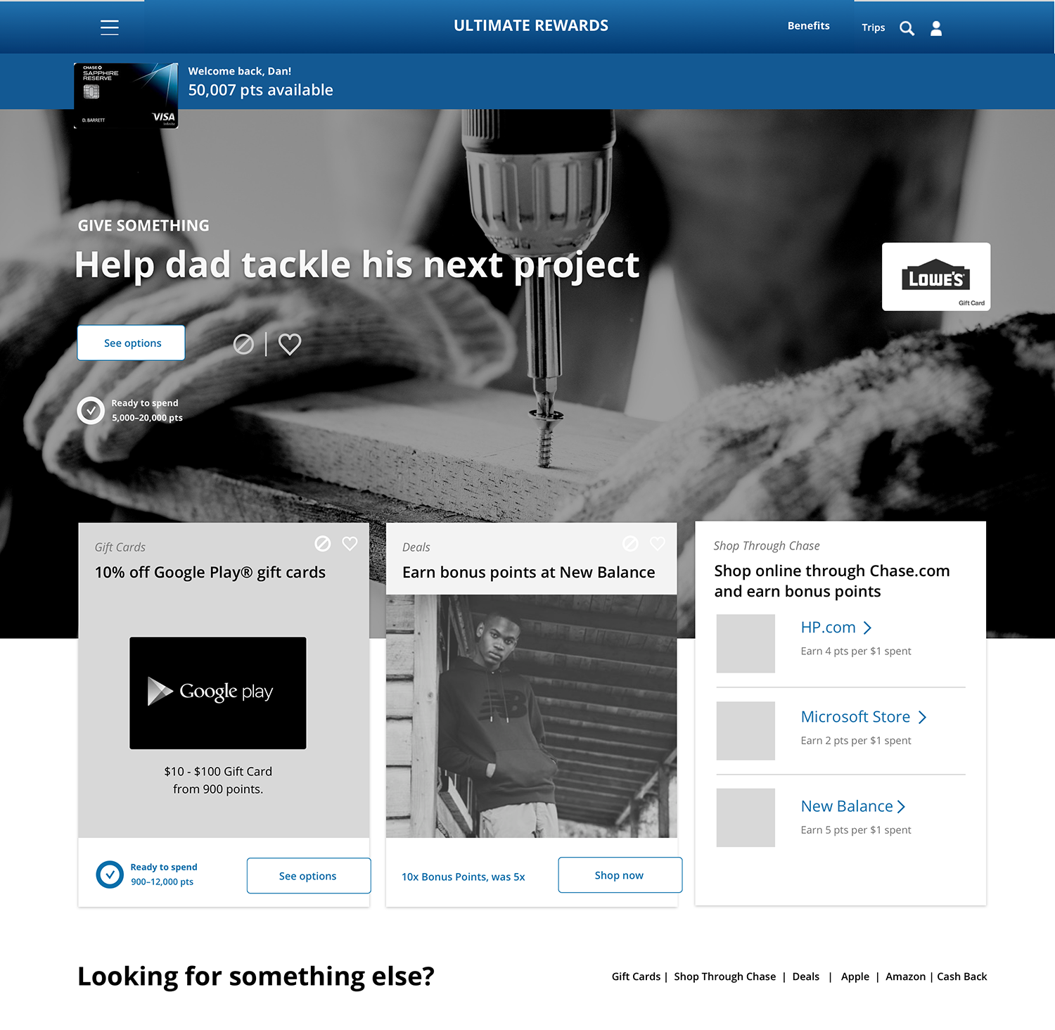
Pairing is caring
To encourage users to redeem other items, instead of cash. I created themes/bundles in each of the sections. This concept gives more context for the user, rather than just having a list of gift cards.
Chase UR hub will be leveraging the user's location and will display relevant travel hot spots for that season.
The Ultimate Ultimate Rewards Hub
Research
Key research takeaways
We interviewed 23 participants to gain understanding of their behaviors and thoughts around Chase's rewards program.
- They want the rewards program to work best for them.
- They do not want to read the fine print.
- The hub lacks delight and joy.
- Mixed feedback on value due to lack of awareness of higher value on travel redemption.
- Users expect exclusive perks. (Similar to Amex)
Understanding user behaviors
During research I identified 3 types of user behaviors.
Non-redeemers
Segments: Newbies and hoarders
- 44% of Chase cardholders
- No redemption in the last 2 years
- Only 32% visited UR in the last year
Goal: Influence this user group to redeem for anything
Single category redeemers
Segments: CashChronic, one hit - wonders
- 50% of Chase cardholders
- All redemptions in the same category
- Redeem in highest in Cash back
Goal: Influence this user group to redeem across varied categories
Multi category redeemers
Segments: Enlightened
- 6% of Chase cardholders
- Redeemed in at least 2 categories
- Users with the highest engagement
Goal: Encourage continued varied redemptions
The data story
25.9M
Accounts
16M
Redeemers
37%
Open accounts only redeem cash.
85%
of Freedom credit card accounts only redeems cash.
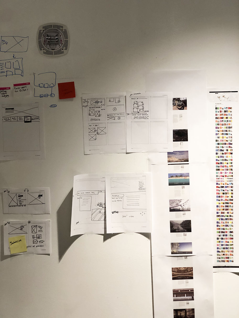
sketches
There is no such thing as a bad idea
Before I got into any type of wireframes, I sketched a dozen or so ideas. We really wanted to leverage a "points" story for the user and also encourage them to redeem for travel or gift cards. The page goal was to change the user's behavior and that is a hard task to do. Especially, humans are a creature of habit. The page had to be compelling enough for the user to change.
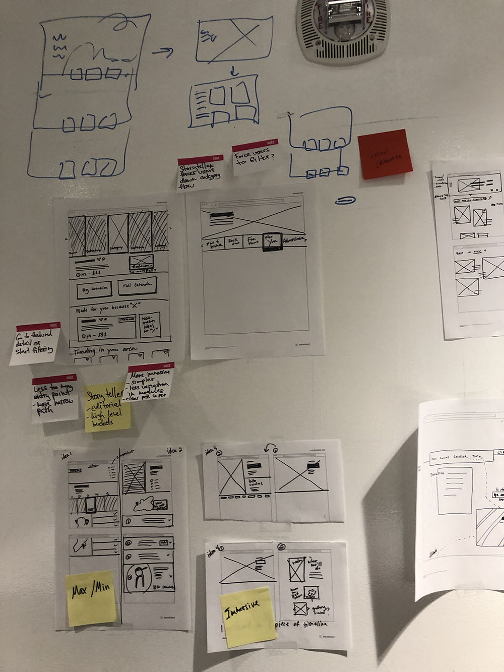

More iteractions with wires
I wanted to create a clear framework that would be able to be dynamic depending on the different cardholders. When I move from pen and paper to digital, I started off with creating a block-level structure of the page.
Then adding more details with low fidelity wires and iterating a few more times to create high fidelity wires.
Launching Chase Ultimate Rewards Hub
As of June 2019, Chase rolled out the brand new design of Ultimate rewards. Most of the card features that were a part of the above concepts (like goal setting, product recommendation, progress of points, and more) have been released or are still in development. If you do have Chase credit card, login to the Ultimate Rewards and have a look of the new design.
© Elushika Weerakoon 2026
Interaction designer / Product designer